American Heart Association
Project Overview
As a subsidiary of the American Heart Association (AHA), the Know Diabetes by Heart and Hypertension websites were developed to raise awareness about the connection between diabetes, hypertension, and heart disease. Beyond education, the platforms aimed to connect patients and healthcare professionals, fostering meaningful interactions and improving health outcomes.
Users and Access
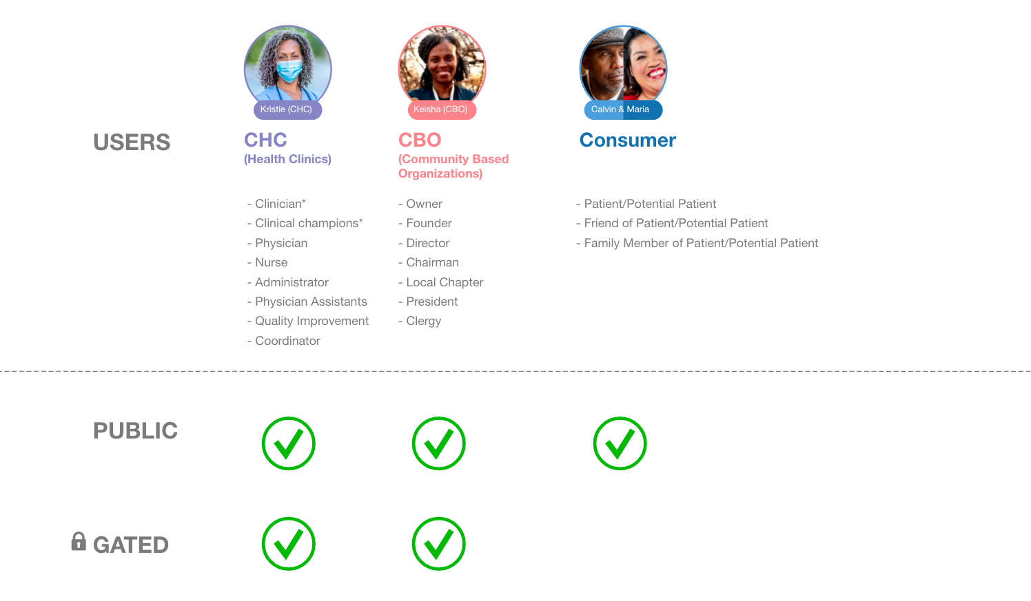
Through stakeholder interviews, different user types and their roles were clearly defined. These groups were then mapped into gated and non-gated access models to determine how content would be shared, restricted, or personalized. The resulting access diagram established clarity around permissions, ensuring content delivery was both secure and relevant while supporting a seamless experience for patients, healthcare professionals, and public health organizations.
Resource Mapping
To accommodate diverse user needs, a content filtering system was implemented to tailor information based on each user's role and journey. A detailed mapping process then aligned content types with user personas and site touchpoints, ensuring relevance at every stage of the experience.
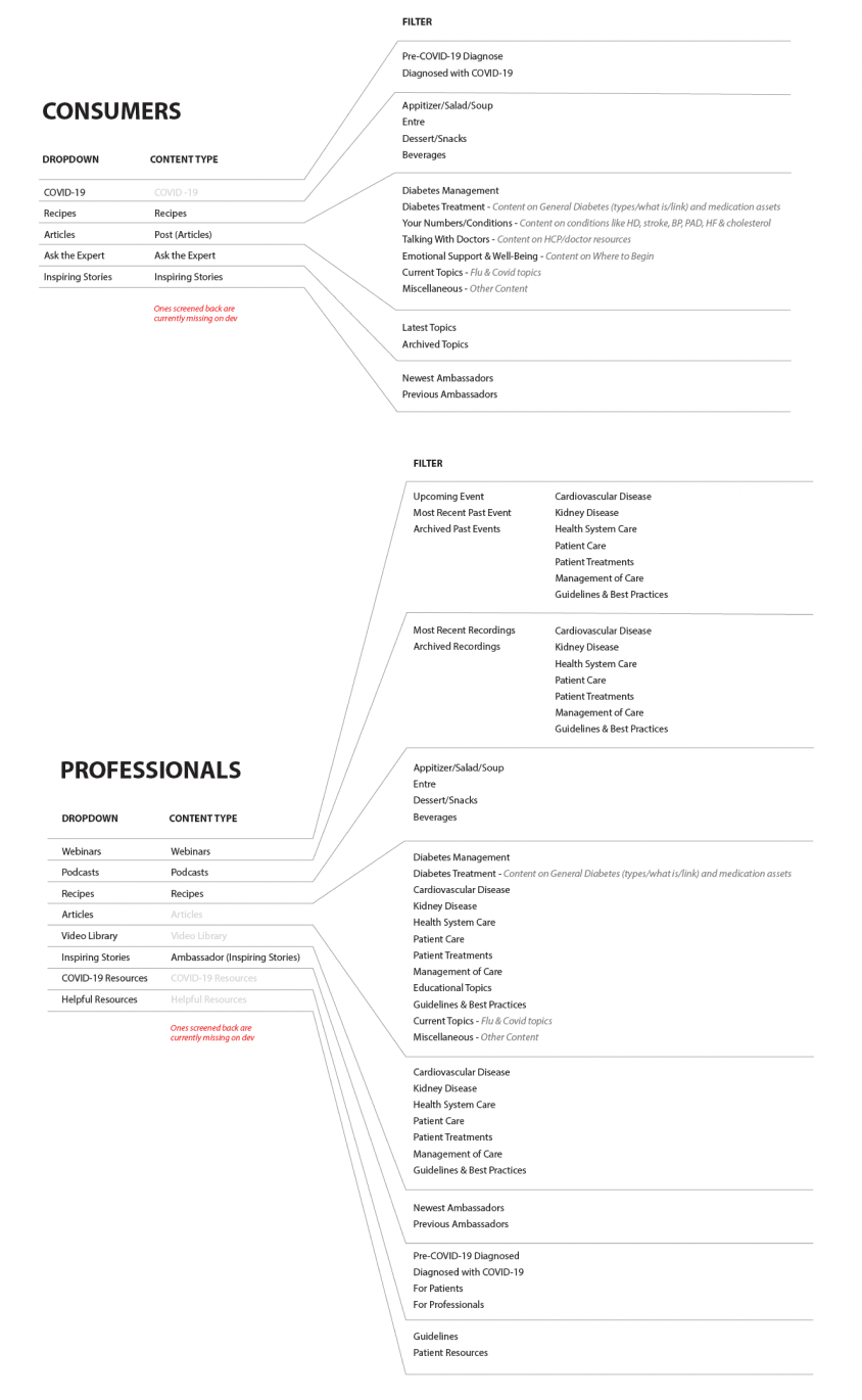
Segment Sitemaps
Two distinct sitemaps were created—one for healthcare professionals and one for patients. Each sitemap was tailored to its audience’s needs while maintaining shared content areas to ensure consistency and cross-segment relevance. This separation was critical to ensure that professionals could quickly access clinical resources while patients were guided to approachable, actionable health information without overwhelming complexity.
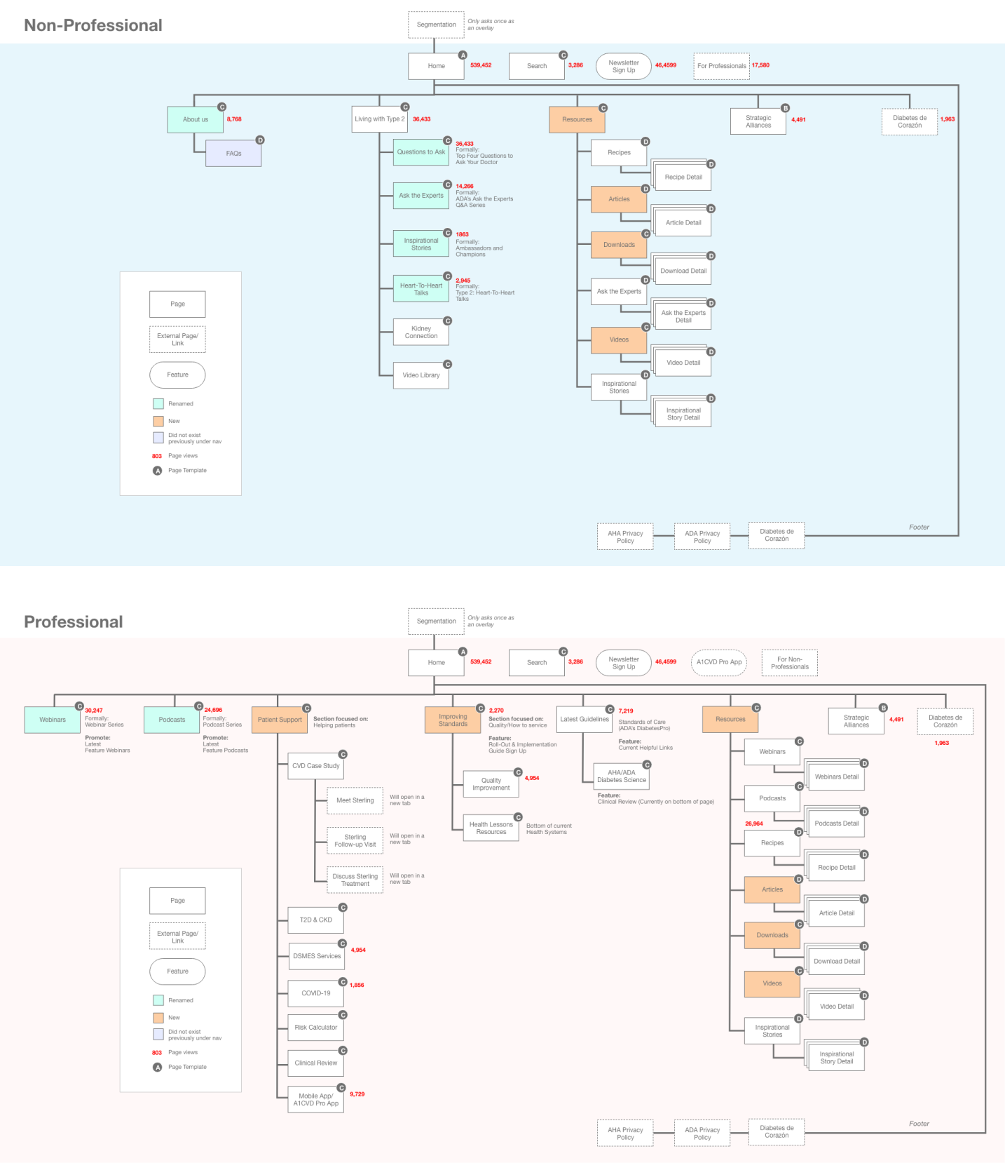
Low-fi Designs
Detailed wireframes captured every aspect of the site’s design, including content placement within templates (top, middle, bottom), behavioral patterns for dynamic components, and responsive design across mobile, tablet, and desktop. Annotated throughout for clarity, the wireframes reduced developer ambiguity and decreased design-to-development iterations, streamlining the overall implementation process.

Hi-fi Designs
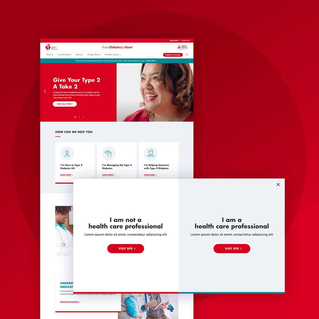
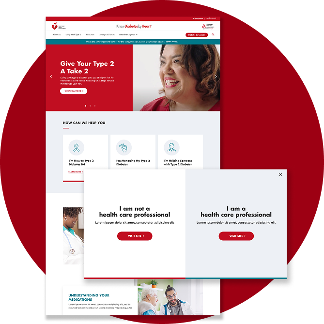
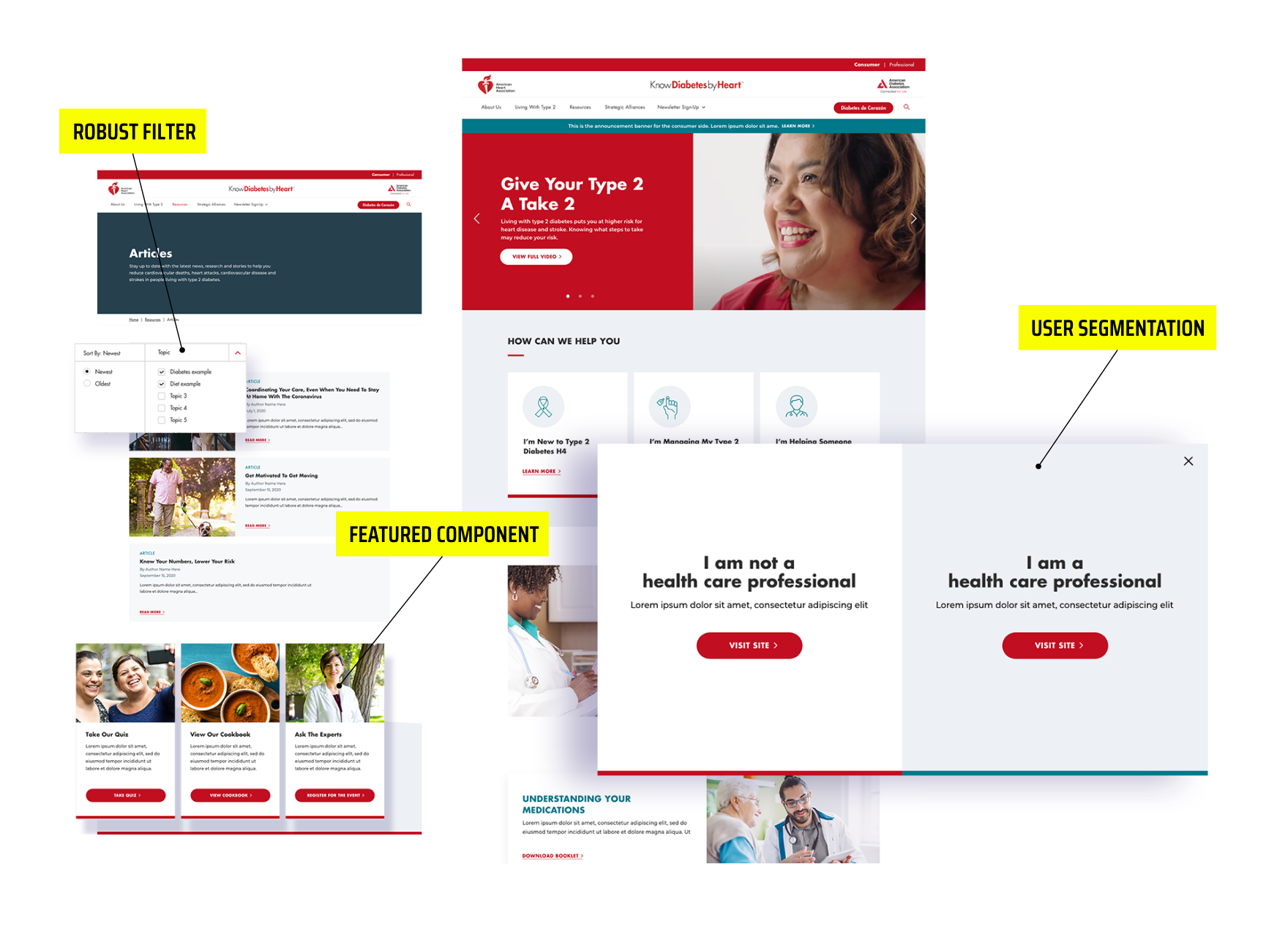
The final designs emphasized simplicity, accessibility, and alignment with AHA’s brand identity while accommodating two distinct user segments. Templates and unique branding elements were tailored depending on the user type, ensuring relevance for both healthcare professionals and patients. Strategic use of typography, contrast, and animations created a cohesive and engaging experience, while motion design guided users and boosted engagement, particularly for interactive resources. These design choices enhanced usability and ensured intuitive navigation across the site.
Results & Outcome
The redesigned platforms delivered measurable improvements across engagement, content relevance, accessibility, and efficiency. Personalized filters and tailored content increased time spent on resource pages by 12%, while overall resource downloads grew by 20% within the first three months. The sites achieved WCAG AA compliance, enhancing usability for all audiences, and annotated wireframes with structured sitemaps reduced developer ambiguity, decreasing design-to-development iterations. By combining segment-specific branding, personalized templates, and streamlined workflows, the platforms empowered users, strengthened interactions between patients and healthcare professionals, and contributed to improved health outcomes.
Summary
Agency and In-House Experience
Below Are Some Examples

Boost Mobile
Led design and research to uncover insights and shape a UX strategy, delivering iterative improvements that created seamless, scalable digital experiences.

BM Loyalty Program
Revamped a points-based loyalty program with early and long-term rewards, reducing churn and boosting long-term engagement.
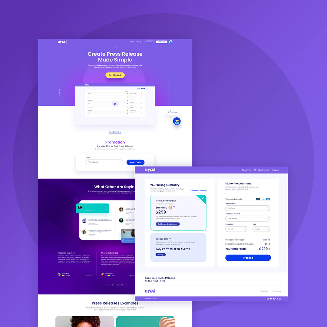
DIYAI
Designed a self-serve AI product with content automation, predictive customer and content vetting, and an intuitive WYSIWYG interface, enabling expansion into new markets.

Chick-Fil-A
Conducted UX evaluation and designed solutions to enhance the order creation experience on the Chick-fil-A iOS app.

Robust Technologies
Designed a custom gated website with strategic user roles and share capabilities to drive lead generation.
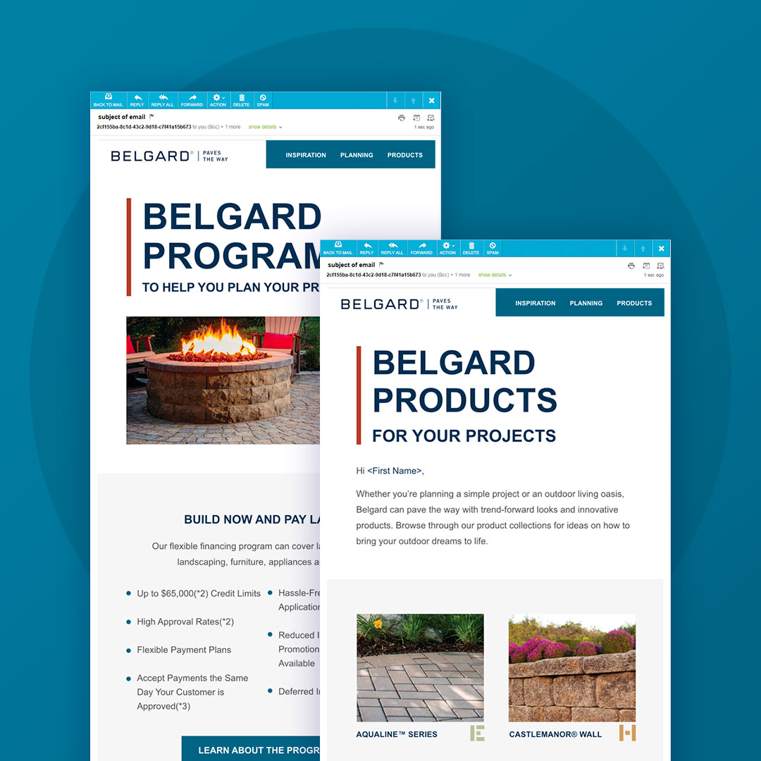
Belgard
Executed comprehensive digital marketing through an omnichannel approach, including website, SEO, blogs, social media, digital ads, email, and microsites.

BW Mobile App
Spearheaded the design of a new mobile app with real-time collaboration, streamlined workflows, and integrated biometrics, MFA, messaging, notifications, and customizable features.
