Belgard
Project Overview
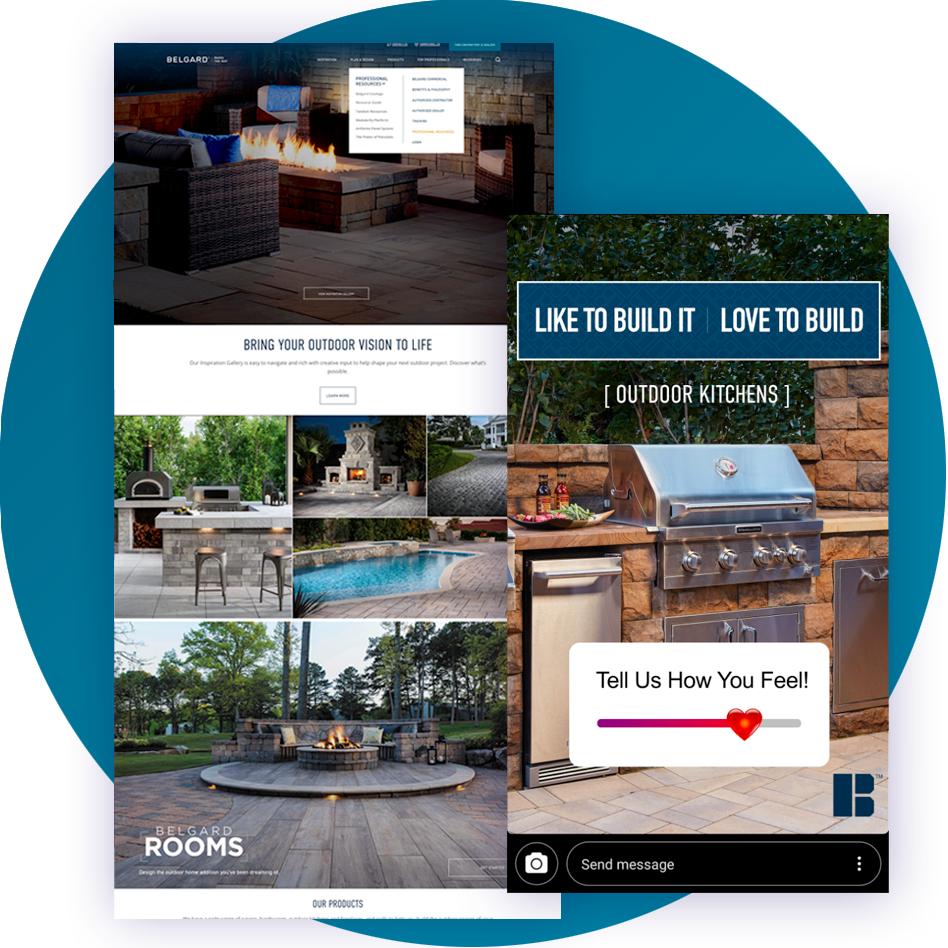
Belgard, a leading provider of hardscaping products and outdoor living solutions, sought to create a seamless omnichannel solution to elevate their digital presence. The project aimed to improve user experiences, boost website conversions, and drive customer engagement by integrating multiple channels to guide residential and commercial audiences to the website. A key objective was to connect consumers with local contractors, streamlining the process of turning outdoor project ideas into reality.
Omnichannel Mapping
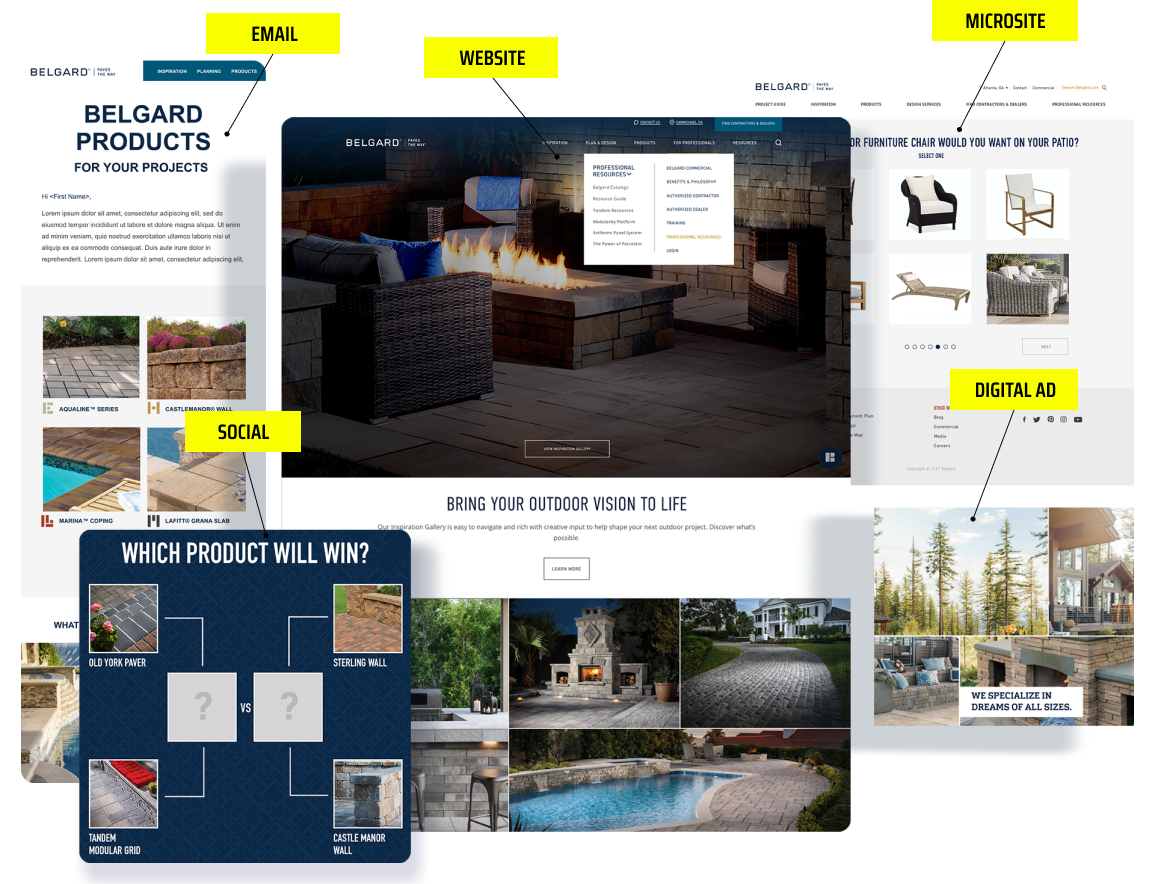
Key touchpoints across multiple channels were identified to create a seamless and consistent user journey. By integrating Belgard's marketing channels with tailored messaging, we ensured users received the right content at the right time—whether they were exploring outdoor living ideas or ready to purchase. This led to a more cohesive brand experience and an accelerated path to conversion.
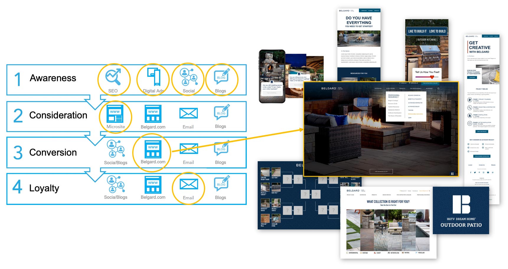
Belgard Marketing Funnel: Website
User Flows
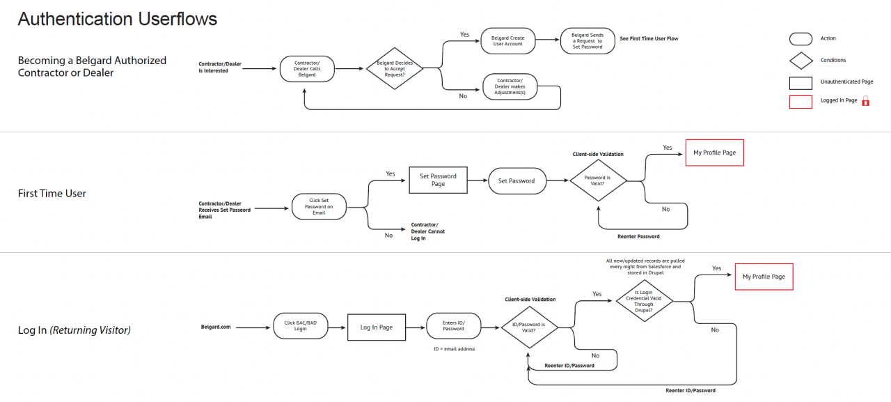
User flows were mapped were defined, analyzing every possible pathway users could take depending on their needs. This helped us understand and optimize key interactions and decision points in the user journey, streamlining the process and reducing friction. Each flow was crafted with the goal of increasing conversions and enhancing the user experience.
Sitemap
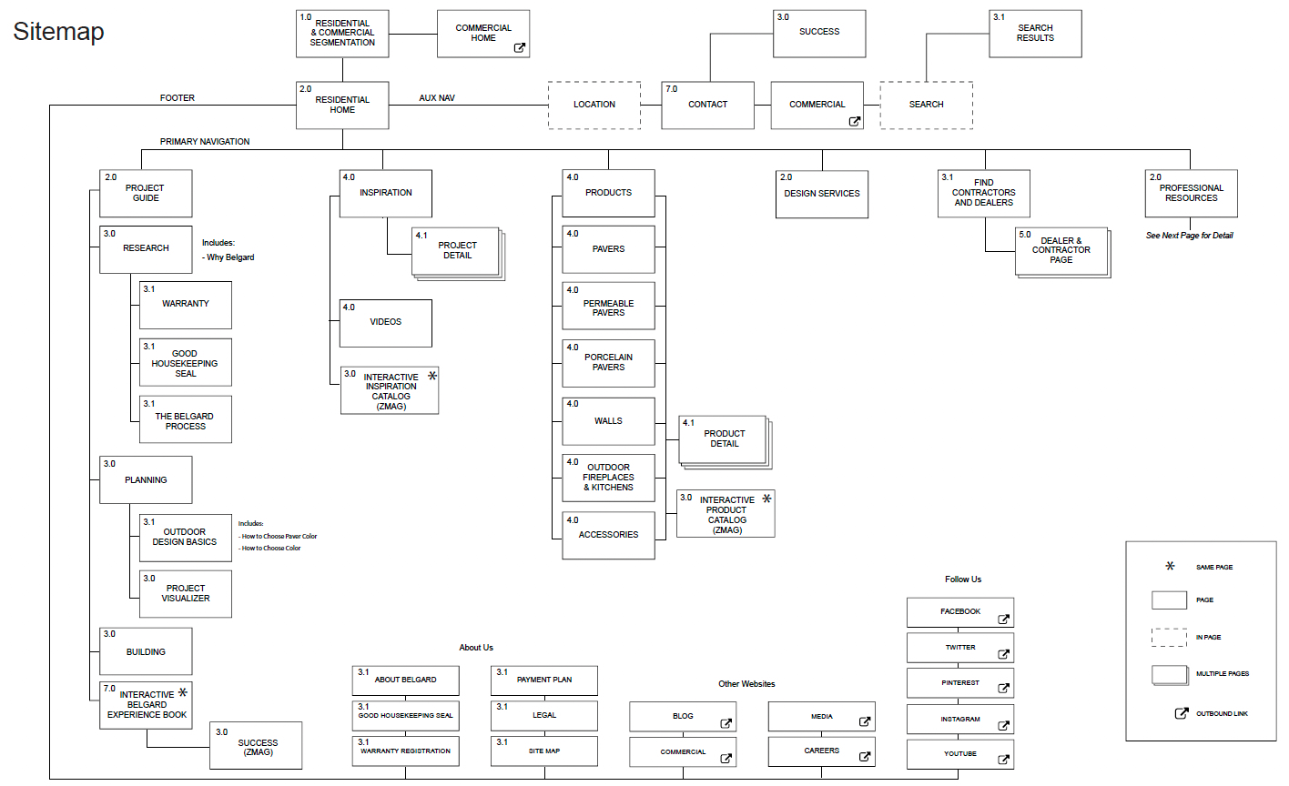
Working closely with stakeholders, an intuitive sitemap was built to understand the website structure in a way that made sense for the user. The goal was clear: ensure ease of navigation, simplify taxonomy, and provide users with an efficient route to their goals. This also involved creating and refining categories, page labels, and navigation menus to make information easy to find.
Design Architecture & Templates
Modular Design Approach
A scalable and modular design system was developed to ensure that every page—whether it's a product page, blog post, or a promotional microsite—maintained consistency and high quality. This approach ensured a unified user experience across different pages while providing flexibility for future updates and additions.
Wireframes & Components
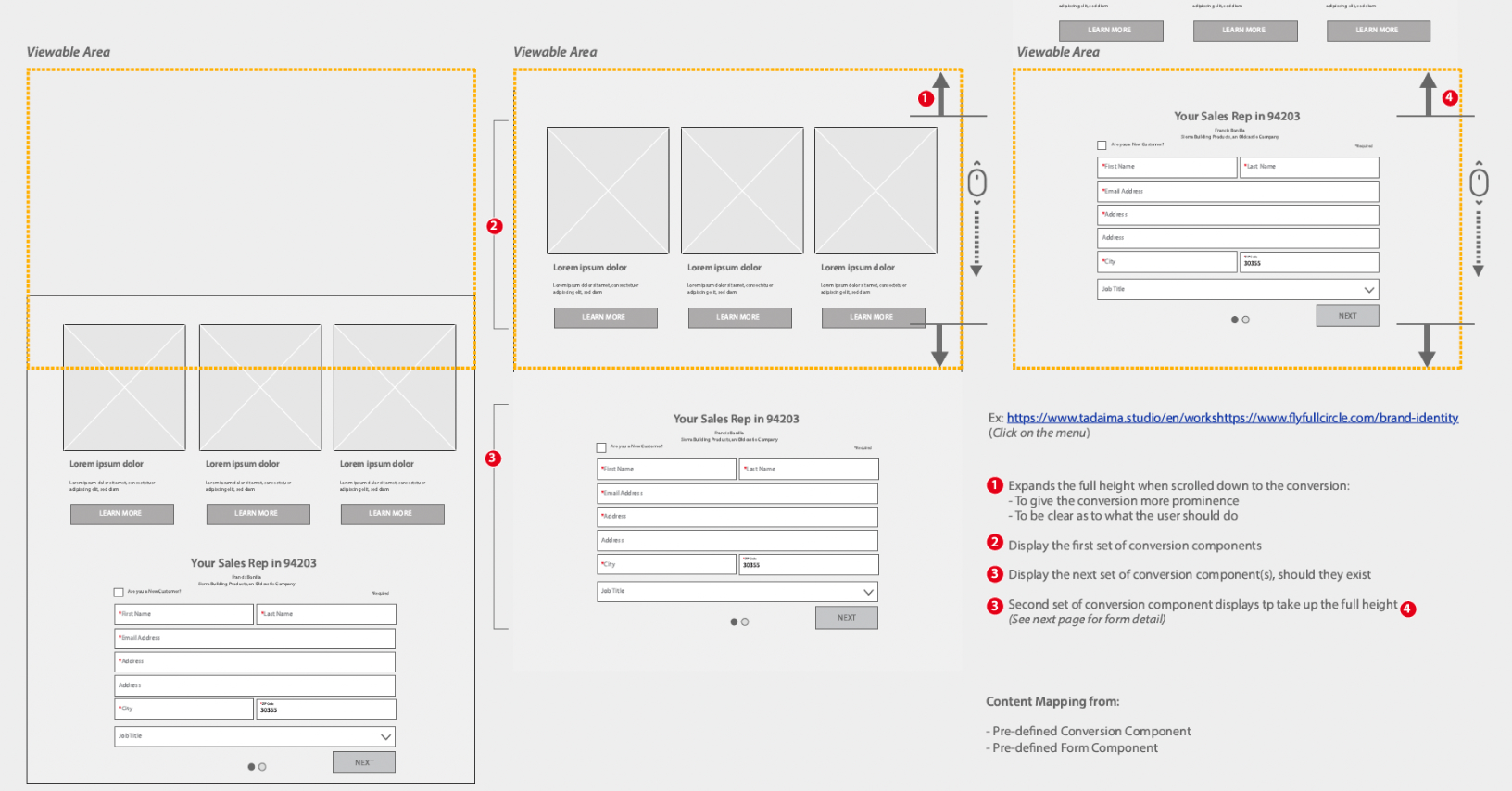
I oversaw the creation of detailed wireframes, each annotated with precise instructions for the development team. Every component was designed to be flexible and adaptable within the CMS, ensuring smooth integration and functionality across all channels.

Collaboration & Execution
Designs
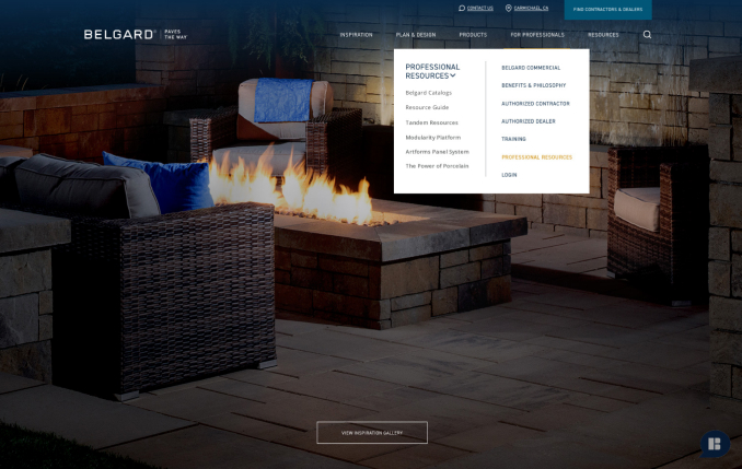
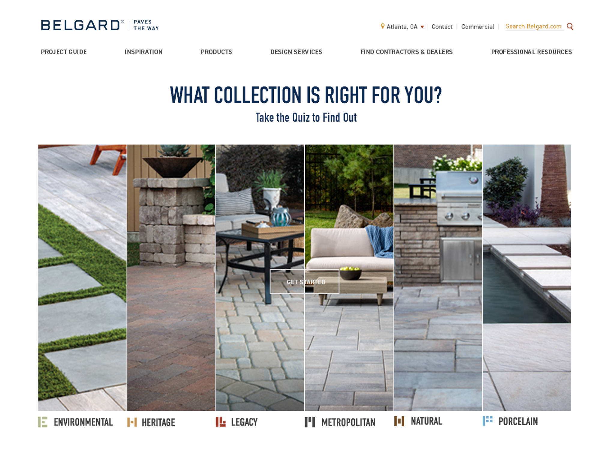
Working closely with Belgard's internal marketing team, we meticulously aligned our designs with the company's core values to ensure the final outcome resonated with the target audience. I spearheaded the creative direction, refining the user interface to strike the perfect balance between aesthetics and functionality, ultimately boosting user engagement and driving conversions.
Microsites
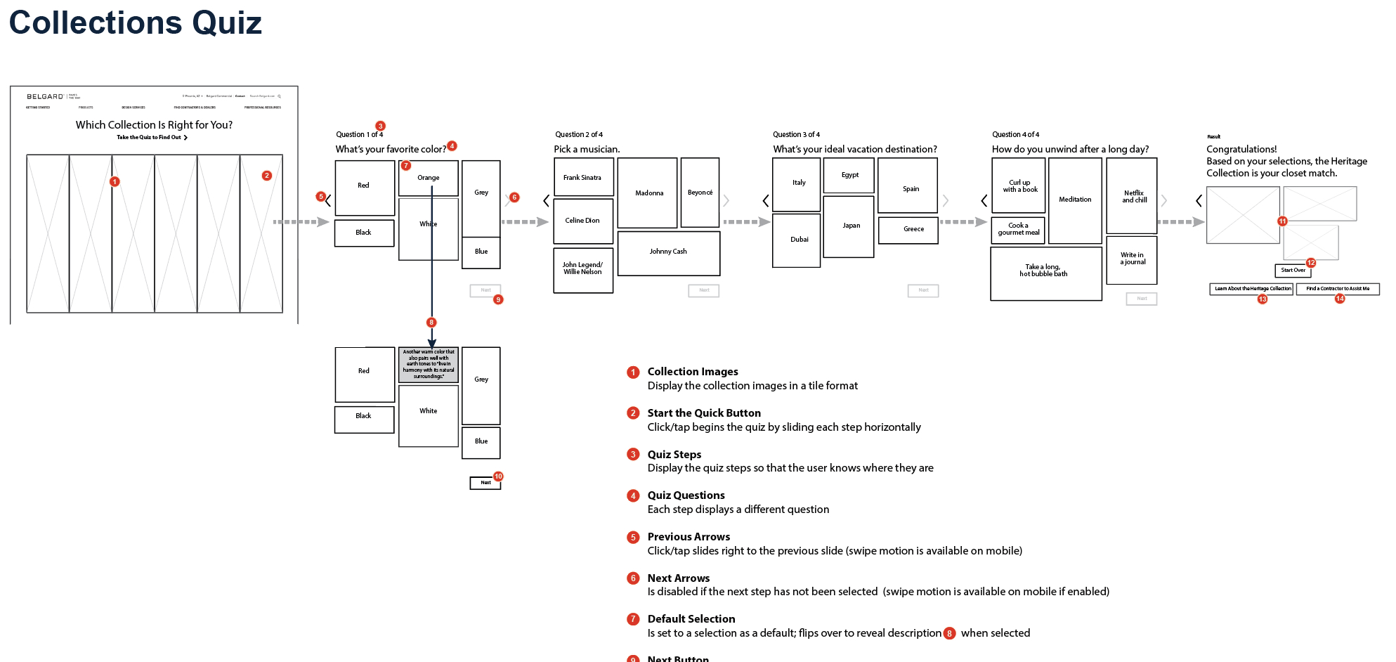
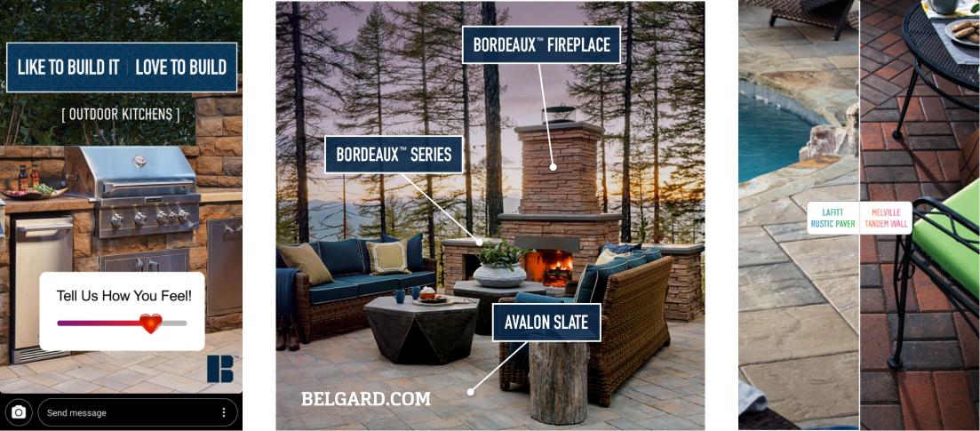
As part of the strategy to capture user attention and guide them toward conversion, I spearheaded the design of engaging microsites like a quiz application. These microsites were designed to inspire and motivate users, with each interaction strategically guiding them to the next stage of their journey.
Email & Social Media Campaigns
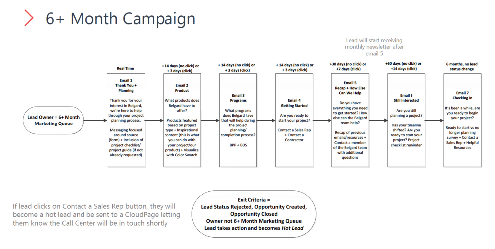
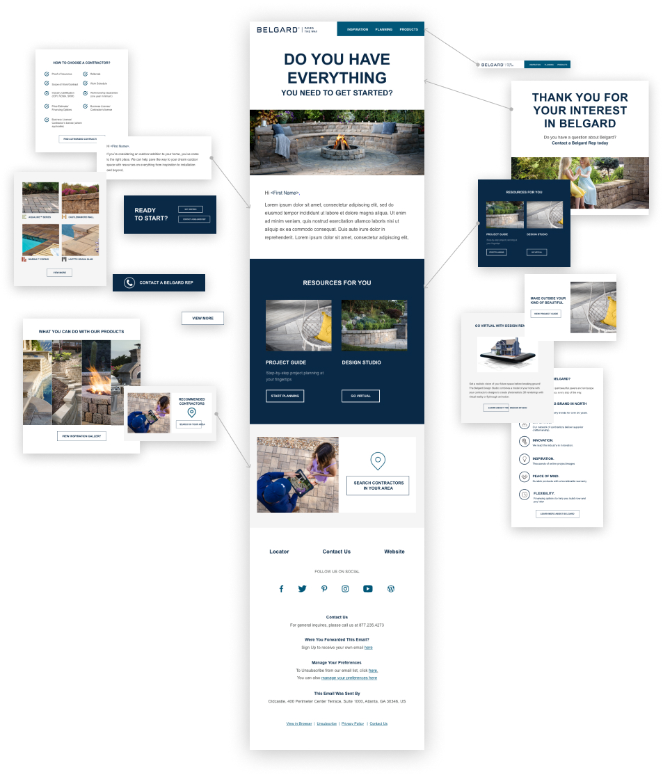
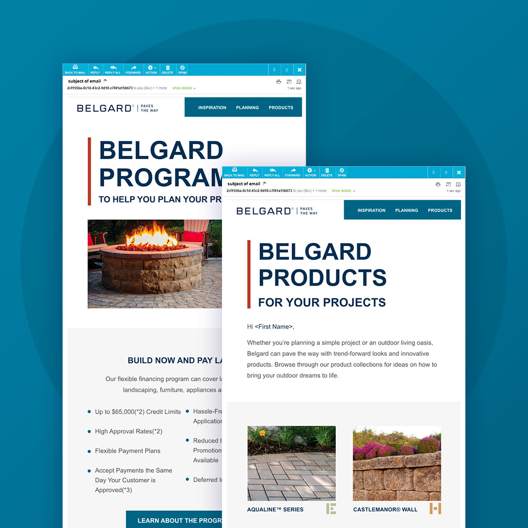
I also led the creation of an email nurturing plan, optimized based on user behavior and engagement insights. Each email was crafted to move users further down the funnel, increasing conversion rates through tailored content and compelling CTAs. For social media, I ensured that the content was highly targeted, with monthly digital ads and social posts based on analytical insights, leading to a 20% increase in website traffic.
Results & Outcome
The completed website gave Robust Technologies a scalable, user-focused platform designed for lead generation and client engagement. Its success led to additional projects, including brochure designs and exhibition materials. By combining personas, conversion funnels, sitemaps, wireframes, and high-fidelity designs, the project delivered a strong digital foundation that enhanced brand presence, streamlined communication, and supported continued business growth.
- Increased website conversions by 30% through an optimized user journey and seamless omnichannel integration.
- Boosted email click-through rates by 25% with a targeted email nurturing plan.
- Improved engagement rates for social media and digital ads, resulting in 20% more traffic to the site.
Summary
Agency and In-House Experience
Below Are Some Examples

Boost Mobile
Led design and research to uncover insights and shape a UX strategy, delivering iterative improvements that created seamless, scalable digital experiences.

BM Loyalty Program
Revamped a points-based loyalty program with early and long-term rewards, reducing churn and boosting long-term engagement.
DIYAI
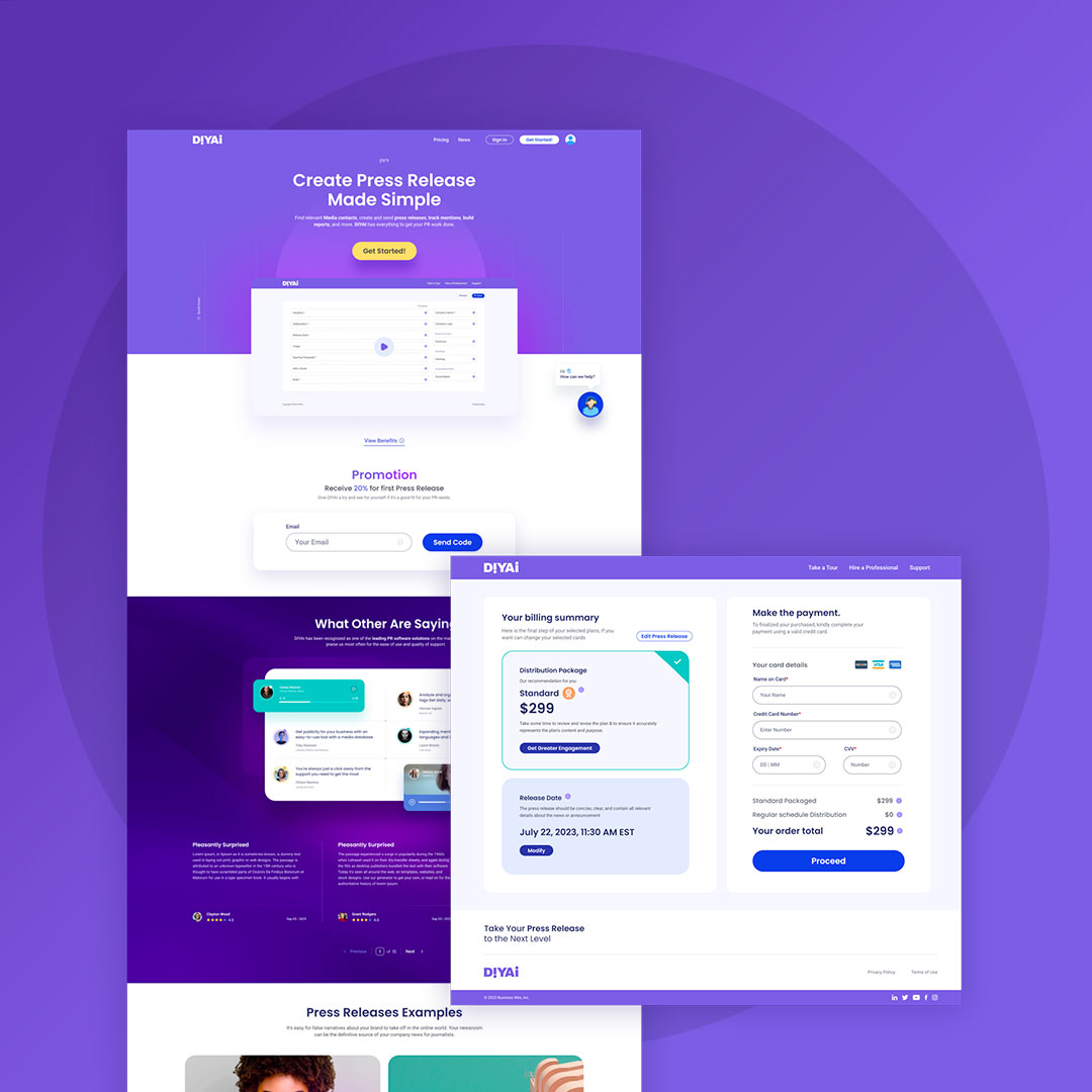
Designed a self-serve AI product with content automation, predictive customer and content vetting, and an intuitive WYSIWYG interface, enabling expansion into new markets.

Chick-Fil-A
Conducted UX evaluation and designed solutions to enhance the order creation experience on the Chick-fil-A iOS app.

Robust Technologies
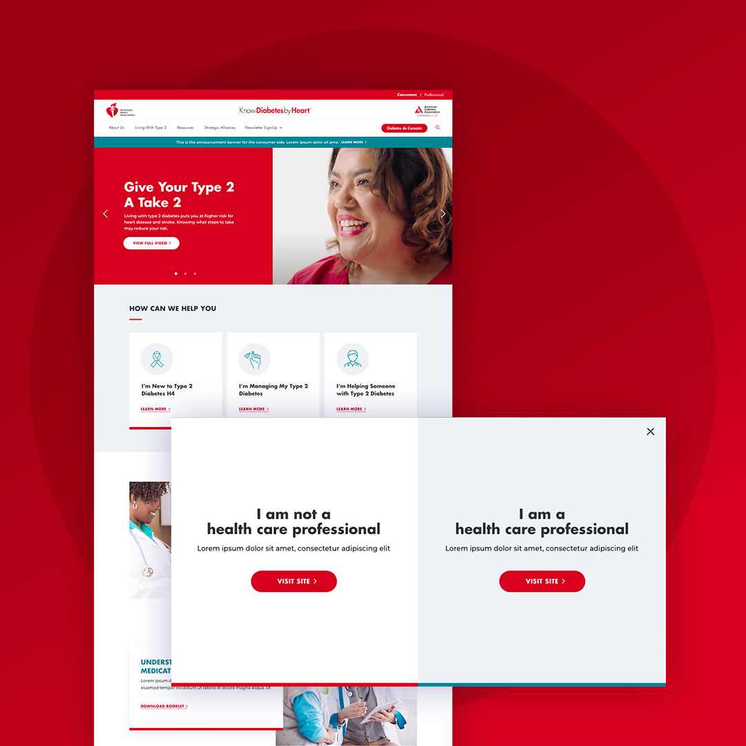
Designed a custom gated website with strategic user roles and share capabilities to drive lead generation.
Belgard
Executed comprehensive digital marketing through an omnichannel approach, including website, SEO, blogs, social media, digital ads, email, and microsites.

BW Mobile App
Spearheaded the design of a new mobile app with real-time collaboration, streamlined workflows, and integrated biometrics, MFA, messaging, notifications, and customizable features.
