×


Scroll or Drag Up and Down to See More.
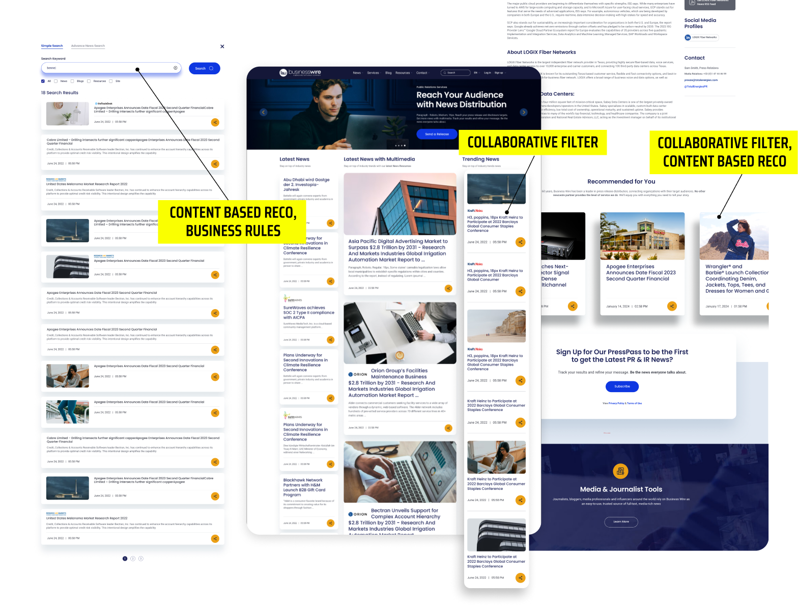
This collective effort aims to streamline administrators' tasks by consolidating all content updates through migration to a single CMS system, WordPress Engine. Additionally, the integration of new APIs, tightly coupled with a Recommendations Systems approach, will personalize the user experience by delivering the most relevant information based on emerging trends and user behaviors.
As a result of this project, a new design system will be established, serving as the foundation for all future design endeavors across various applications. To ensure its success, meticulous brainstorming and planning were prioritized from the project's inception, while ongoing communication and collaboration played a pivotal role in ensuring alignment among designers and engineers throughout the project lifecycle.
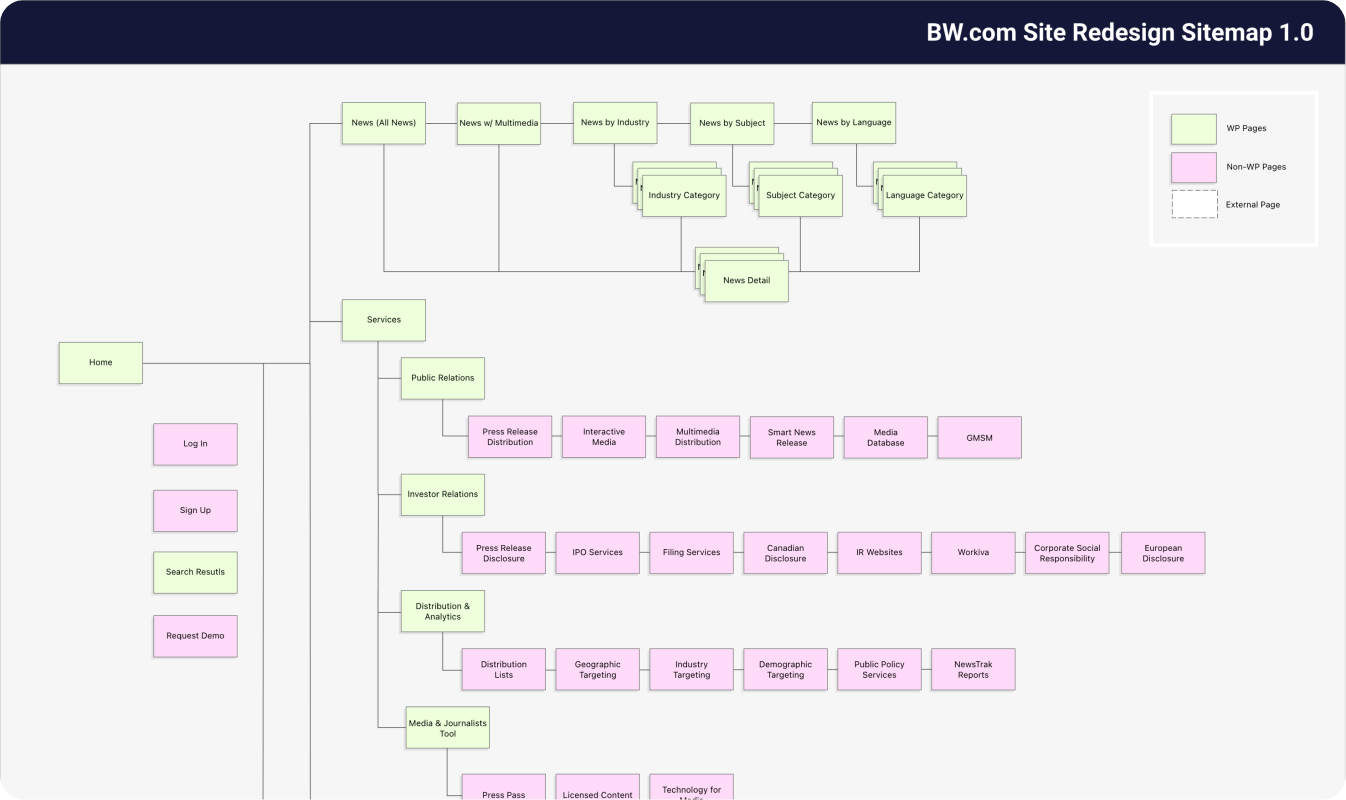
A comprehensive sitemap was meticulously crafted to map out all pages within the new site design. This process involved identifying elements to be included in the new CMS system, WordPress Engine (green), as well as those earmarked for future integration (pink). This strategic approach was devised to facilitate the content migration strategy, particularly for content existing across multiple locations, while also ensuring adherence to the project schedule.
During sitemap creation, careful consideration was given to determine which pages to retain, consolidate, remove, or transfer to new sections. This decision-making process was informed by stakeholder interviews and detailed analysis of analytics reports, ensuring alignment with project objectives and user needs.
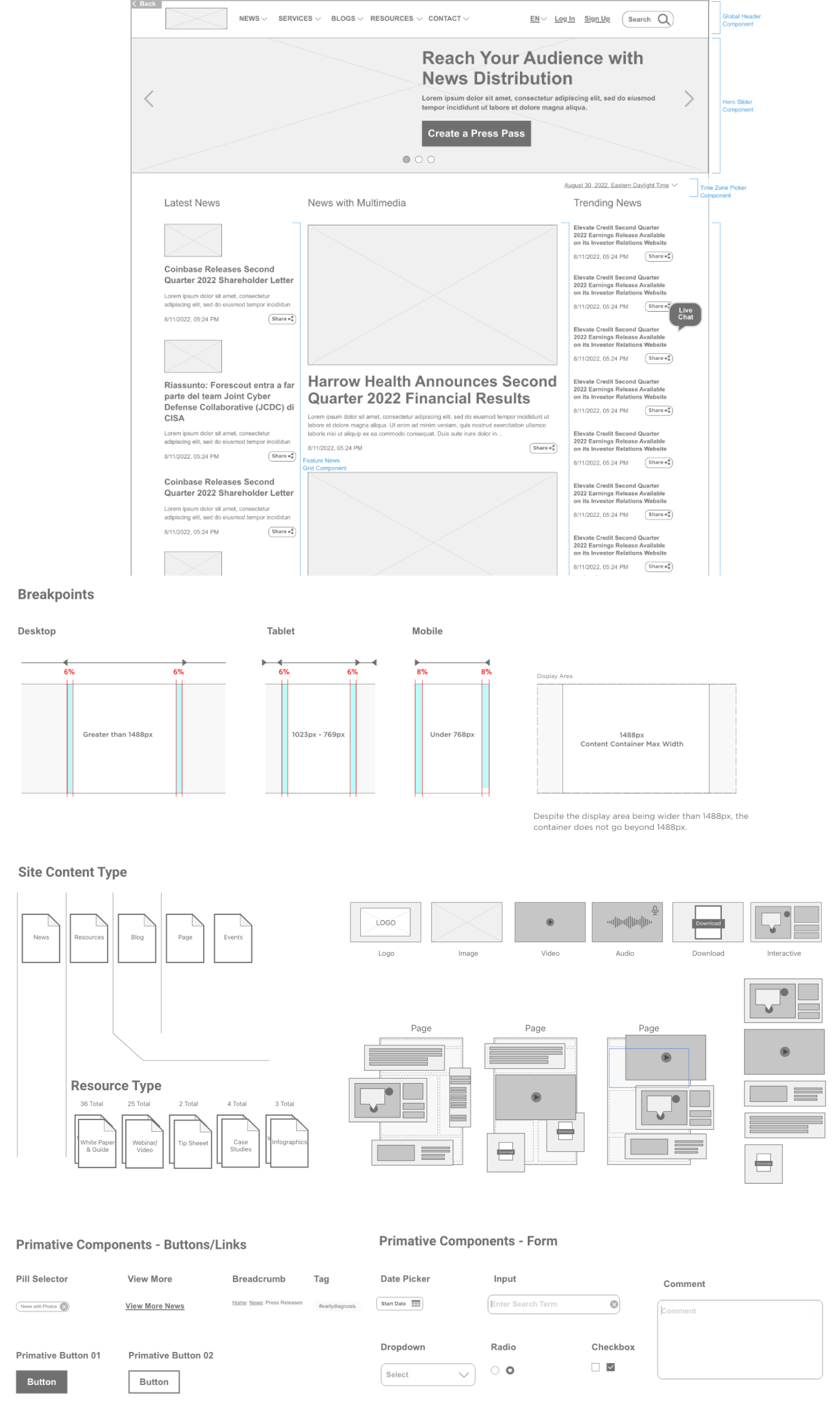
The wireframe creation process involved carefully identifying each component along with its classification, purpose, and optimal placement within the interface. It also entailed identifying various content types and determining which components could seamlessly integrate within different page templates. Serving as a dynamic working prototype, the wireframes provided stakeholders with a tangible framework for providing feedback and insights. Engineers leveraged the wireframes to proactively identify potential technical hurdles and offer recommendations, ensuring smooth implementation and alignment with project objectives.
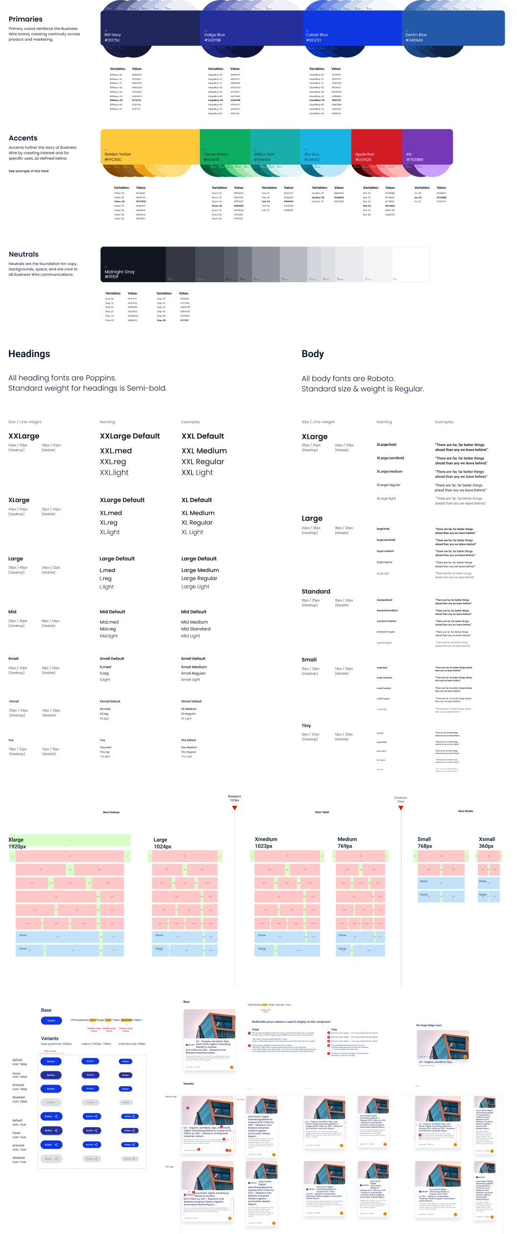
With the increasing trend of news consumption on mobile devices, responsive design became a crucial requirement to address a significant user pain point. The challenge lied in accommodating diverse combinations and varying lengths of news content.
To overcome this challenge, scalable designs, the latest HTML techniques, and advanced calculations for neighboring cells were employed. This approach ensured the maintenance of natural and predictable layouts, enhancing the seamless and effortless consumption of news content through smart design and layouts. By prioritizing user experience and adaptability, the aim was to enhance the mobile news consumption experience through practical design solutions.
As part of the effort to "modernize" the website, the color palette was revamped to align with contemporary standards and establishing a scalable system to enhance consistency and coherence. This encompassed defining grids, padding, margins, and scaling rules to effectively layout design elements.
The overarching goal is for the redesigned website to serve as a master design library, setting the standard for the creation of the broader product design system. This unified approach ensures that all applications inherit a cohesive design language, fostering a seamless and harmonious user experience across the entire product suite.
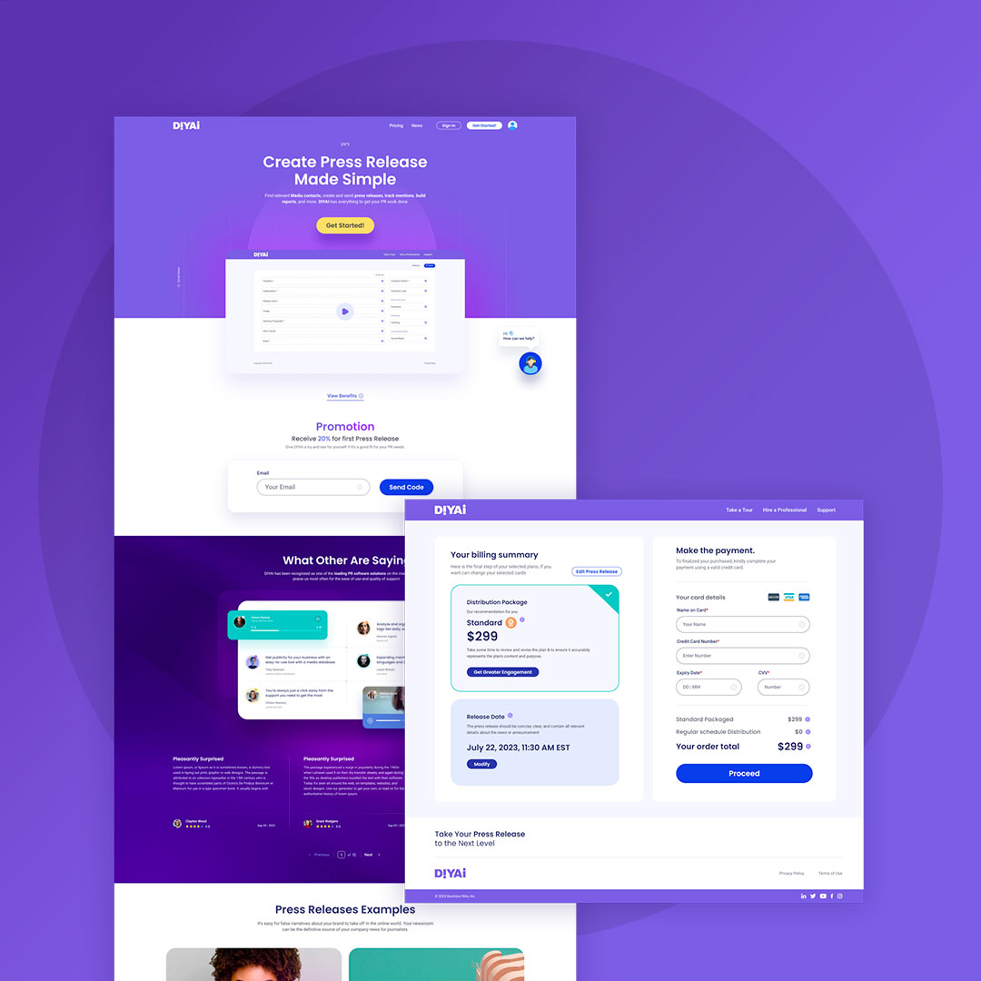
Self-serve product with content automation, predictive customer vetting, WYSIWYS interface.

Integration with biometrics, MFA, messaging, notifications, customizable features.

Cloud migration, consolidatio of CMS onto WordPress Engine, Recommendation Systems, and personalization.

Unify payment system, income verification, reserve, secure, and monitor apartment unit under a single app.
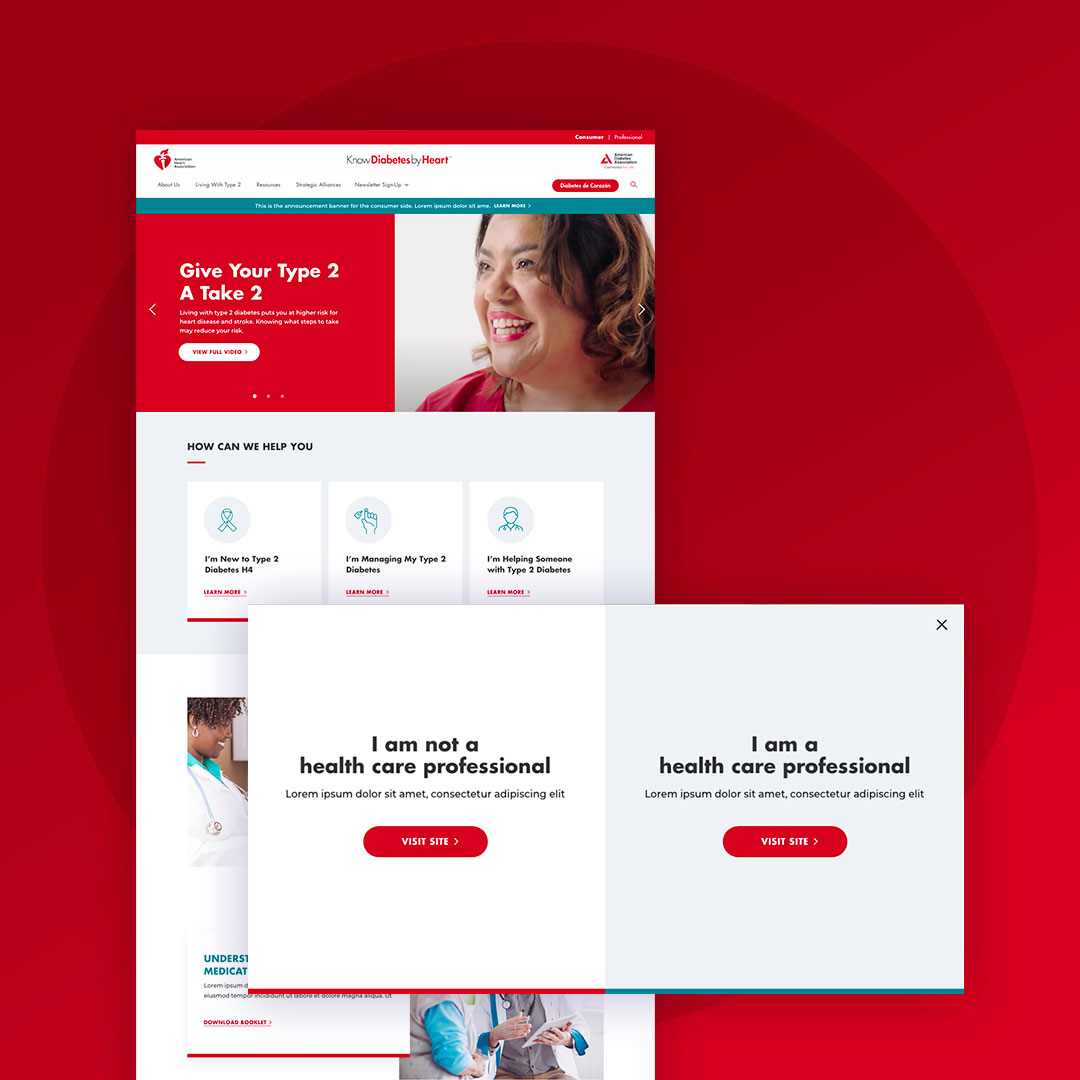
User segmentation, modularity across multiple sites, content/labeling/categorization/keyword mapping, conversional strategy.
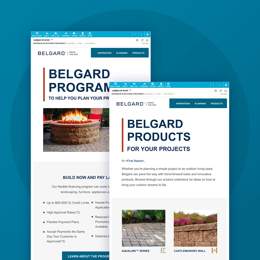
Comprehensive digital marketing with an omnichannel approach: website, SEO, blogs, social media, digital ads, email, and microsites.